Monday, 3 September 2012

Designing DPS 4

I am going to base my second DPS on London. I want to make it quite a patriotic page. I am going to base the measurements on Marie Claire. I am not sure how I can link this up well, I had a few ideas about making a guide on good resturants, or good things to do, or shopping.
I am going to Buckingham Palace in the holidays so I am going to take photos of my day and see what type of article would make the images work. I am going to use my own images here and then use a found piece of text as I am going to do my next DPS with my own writing.

Here I am going to make the set up for Marie Claire InDeisign pages:


I am going to search the internet for articles that I could use, in preporation for the images that I want to take. I think that doing it this way around would work just as well then I have an aim for the images and I won't just be taking photos of any thing in hope that it will link well to an article. So I think that doing this will make the whole article work a lot better.

I have found an article about the Palace, and about the state room which I am going to see. I found it on a blog from the internet.

http://gardenofeaden.blogspot.co.uk/2012/05/london-buckingham-palace.html


Photographs.

Here I am going to show the contact sheet of the photographs that I took whilst up in London.  In the state room, which I went to visit, we couldn't take photographs unfortunately, so I have taken a selection of Photographs around the Palace. I am going to search the internet for another selection of articles that I could use. I have decided that I dont want to make them directly about the state rooms and more about the surrounding area, or possibly the changing of the guards or something along those lines. I am going to take time in reading these articles so that I can link it well to my photographs. I have chosen to find an article for this DPS as I feel that I don't know enough facts about that part of London, but I loved taking photos there which I think is just as important for the DPS.

Here are my contact sheets for the trip I had to London.


Now I have edited some of the images that I think would give me a little more inspiration to make the DPS. I have decided to go for a 'tourist' theme of images. Here are the images that I have edited:


----------------------------------

I have found an article online which I think fitted really well into the images that I have as the article that I found before, is all about the state rooms that I went to see, but unfortunately, photography wasn't allowed inside the palace, so therefore the article that I found before is no longer appropriate. I am going to go through this article and see if it can fit in well, as at the moment it seems like a guide rather than an article and maybe change some parts in order to fit better.

It is from this site: http://www.allinlondon.co.uk/life/index.php?fid=88&page=1

I have also thought of another idea that I had for this layout. I was looking through my photos and I really liked my image of the London bus. I tried looking online for an article that I could use to have this image and focus well on this and use text as the main eye catcher.

http://www.doubledecker-bus.com/history/

----------------------------------

Here I am going to show to beginnings of my designing for this DPS. I have decided to go for the London bus article. I think that I can enjoy this more and can relate to it better than doing a wide spread article on something that can only be explained in photographs.


I have chosen to go for the title 'Where to.. MISS?' as it reminds me of when a lady would jump onto the bus or a train in the times that these were around and the conductor would ask her journey in order to give her the appropriate ticket.


After looking on the internet I have had some ideas about combining this with the  old style transport for London posters. I love the simplicity of them and I think that this would work perfectly. I might try and have a go at writing my own article for this, but firstly I think I will do some research into other articles that are about old style posters. I am going to combine my own imagery with found for this article as I think it would work just as well with my image of the London bus.

----------------------------------

I have started to look at found imagery of the Transport for London poster from a variety of times. Here I am going to show a few that I found that I think could be quite uselful and would go well with my work. I am going to show the information that comes with the posters, so there is information for me to look back on that I can write and relate to to for my article.

All of the following images are from : http://www.ltmcollection.org


Omnibus, Tramway, Underground maps free, by unknown artist, 1922
Published by London Electric Railway Company , 1922
Dimensions: Width: 255mm, Height: 355mm


15 minutes and where are you, by F P Restall, 1923
published by Underground Electric Railway Company Ltd, 1923
Printed by Waterlow & Sons Ltd
Format: Double royal
Dimentions: Width: 635mm, Height: 1016mm


Saloon coaches for pleasure outings, football and theatre parties, by unknown artist, 1927
Published by Underground Electric Railway Company Ltd, 1923
Printed by Waterlow & Sons Ltd
Format: Panel poster
Dimensions: Width: 354mm, Height: 502mm


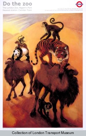
Do the zoo, Rachel Widdows, 1991
Published by London Underground Ltd, 1991
Commissioned by Art on the underground
Format: Four sheet
Dimensions: Width: 1016mm, Height: 1524mm


Always stop when hailed, by Tom Eckersley, 1945
Published by London Transport, 1945
Dimensions: Width: 502mm, Height: 623mm


 I have made a few changed to make the DPS just right. I wanted to just perfect it slightly.

Here is the DPS that I feel happy with.


Designing DPS 3

This double page spread I am going to base on a few days work experience that I have had over the summer. I am going to use my own imagery that I took whilst doing the experience and also I am going to write my own article for this.

I did work experience at Love it! magazine in London, near Holborn.
I am going to base the measure measurements on Love it! magazine so that I can put this DPS into the magazine to make it seem fit. I am going to try and get a similar style as to what I was working with at Love it! The only thing that is going to prove quite diffilcut with the DPS is that I won't be able to use the same typefaces that is used at the magazine as they have their own. They use a typeface called DIN as their main base typeface which is used in most of thier articles, I will try and match this as best I can with found typefaces online and also go through what I already have.

Here I have taken the measurements for Love it! :

285mm x 205mm


Here I am just showing a few screen shots of my first trys at making the DPS with the images that I have. I have put half of my article in there just to get the image text wrap correct and in place. I haven't completed my article yet as I am going to pratice placing images beforehand and get the title fitting and linking well to love it! magazines theme they currently have. 


I can't have the typeface that Love it! use as they have bought it, and it is not a preset typeface. So I searched the internet for a typeface that I could download that was as similar to DIN as possible. I found one called 'Hit the road' which is really close to a match and I think works really well with linking it to Love it!

-----------------------

I have now finished writing my article, there might be a few changes that I am going to make but as a first draft to get onto the layout to see how much I have under or over.

Here is the article:


Work experience article

Head: All in the name of... Experience

Sub: After a lucky break, who know what other luck follows?

I was sitting at home, for two days straight applying and sending my CV of to as many magazines that I could find, from the Tunbridge Wells SO magazine to Yachting Monthly magazine. After a few days of waiting for a reply of any sort I received a message from the Art director at Love it! Magazine offering me a few days work experience helping out the art team in their office. I was so excited to get a offer, especially as I had done all this off of my own back, I felt a good sense of achievement! I was offered to go to their London office near Holborn for 4 consecutive Wednesdays in August, I quickly snapped up this opportunity!
On my first day at Love it! I introduced myself to the Art Director, Jackie Jenks, who was very friendly and more than happy to introduce me to who else I would be working with that day. I was sat a spare desk for the day, and given my first task of placing new text on to the stars page in the same style as previous issues, also choosing and cutting out the right image for the page. After I felt that I completed the page I went to show Jackie who then made a few suggestions for me to do, so I went away and did those, returned to Jackie who said this was good. Then next step for the page, was to put it on the editors desk, to be signed off – last say of the final draft of the page. The page appeared back on my desk within 10 minutes, with the editors signature, I felt proud that I had competed my first page in a magazine! That day I was still getting used to the way I should be working in an environment like this but loved every minute of it and couldn't wait until the next week! At the end of the day we signed off our computers and went on our way. (as the olympics was in full flow, we left slightly early to get home at a reasonable time!)
The next week as I arrived I met another member of the art team, Paul Harvey, who helped me settle again in my desk and given new pages, this week a little more exciting. I was given the 'real life body shock' page to do. For this I was given a selection of images to choose from and cut out then add the text that was already on the server, written previously. This page I had slightly more control over as it was me who was to decide where the images were places and the size of the title along with making sure all the text fitted into the amount of space allowed on the page, still giving space for the images. Once I had completed the page I did the same process as the previous week with checking and making any suggestions made by Paul, then it went to the editors letter.
On my third visit to Love it! I got in and was given again something, again more exciting that the previous week, the art team had set aside a double page spread of an interview with Laurence Bowen. What I needed to do for this was select suitable images from a photoshoot and interview done with Nanny Pat (from TOWIE). I found this layout a lot more fun to do, as it was not only to do with the department I was currently helping, it was also the celeb desk, as the interview and photos were done by these, so once I had done this, I also had to check it over with the ladies on the celeb desk – which meant 2 different opinions! In the end we found a happy medium and was finally sent to the editor.
On my last day at Love it! Soon after I arrived I was given another task that had been put aside for me. This was the fashion pages. I was surprised to be given a page like this, as I had only been there a few days and this has a lot of things to try and fit on. I spent the morning moving shuffling and starting over with this layout, but I had a lot of fun doing it! Again here I had so much more freedom that before, I was able to choose the colour scheme on the page, text sizes and where images where placed. This was a day where Paul had to be on a photoshoot so therefore I checked with a junior on the art team who showed me other suggestions of slightly changing the layout as she was the usual person for this job! So she knew exactly what works well. After printing and checking a few times I sent this over to the editor who sent it back with the signiture within a few minutes. Again, a proud moment to see my page that I had done pretty much all by my self to be signed off to be going in to the magazine.
After completing my 4 weeks at Love it! I am so happy to have done it. I have learnt so much. Art Director Paul Harvey has good contacts and has asked me back in coming months to do more work experience. Also contacted his friend at Tatler magazine, which I am now waiting on a week which they have time to fit me in for a week of work experience there. I couldn't be more happy with the outcome and everything that I have gained here at Love it! So Thank you!

---------------

After writing the article, I have put it into the DPS on InDesign, here is how it looked with some images put on:


I am not too sure if I think that the text for the article is slightly too bold. There isn't a regular option, so it is this or I will find something different. The only reason I don't want to change the font is because is fits so well with the typeface that Love it! already use so I don't want to go away from this too much. 


Here I have added the baseline grid which totally changes the text and the layout, I think that I could move the images around slightly so that it fits in well with the DPS. I don't want to add any more to the article as I think it is quite long anyway, and I dont want to over power the whole point of doing these layouts which is to experiment with type. 

I moved everything around slightly but I need to spend more time on getting the images to the perfect size and in the right place in order for everything to sit on the page and look in place. 


I think that this layout is looking quite good and linking well to Love it! I think that the colour scheme that I have used also looks good, and until I have printed it off, i'm not sure what it will look like completely with the magazine.

------------------------------

I have come to the conclusion that I am really not happy with my design. I think the writing is too bulky and the title and images just are not working well together. I think that this clicked in my head once I left it a few days and came back to it after.

I have done a lot more designing and moving around with this DPS and this is a what I have come up with so far. Already I am happy with the changes.


It isn't in the style of Love it! which is what I was originally planning. But I just don't feel as thought that is my style of designing and if I was to get a job in which I don't like the design and don't have the options to change it, only then will I go along with something I am not totally happy that it is not 'ME'.

I have changed the fonts completely too and like I mentioned before, the text was way too bulky, all throughout the DPS.

Here is a final idea that I have had. After changing many parts of this DPS I am really happy with it. I still need to add a few little bits to perfect the DPS to finish off with those professional touches.